I’ve been on a recent search recently for an iPhone App that conveniently calculates the cycle time of an operation. I found one that looked interesting and helpful enough. So, I decided to take it out on a test drive while sitting at local McDonald’s Franchise – in this case, I’m measuring a critical process step in a restaurant operation. You can also view all 40+ articles on Queueing Theory.
To my surprise, the iPhone App did more than I expected. I was able to calculate Server Time at Point of Sale (Cycle Time from order beginning to paid), and the iPhone App then calculated an Individuals Moving Range (IMR) Control Chart as well as a Run Chart. Pretty cool. And, to have the ability to do on-the-spot time studies like this is invaluable for me – while at the Gemba, I can do a time study and have the data calculated and visualized for me immediately. Very helpful.
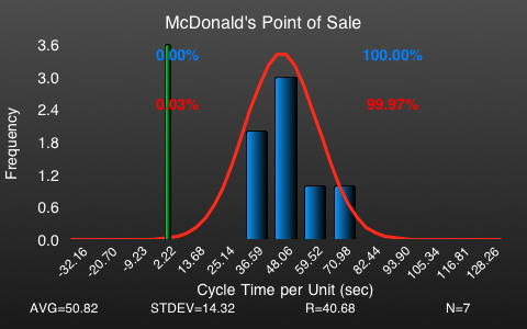
Here’s the Point of Sale distribution at the McDonald’s. Each unit is a paying customer and I calculated their time from the beginning of giving their order to the time when they received their receipt.

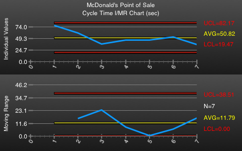
Here is the same data, but the iPhone App calculated the IMR Control Chart, showing Upper Control Limit (UCL) and Lower Control Limit (LCL). I’m not sure how useful this is for the operation I was measuring, but it’s pretty cool that the iPhone App conveniently does this.

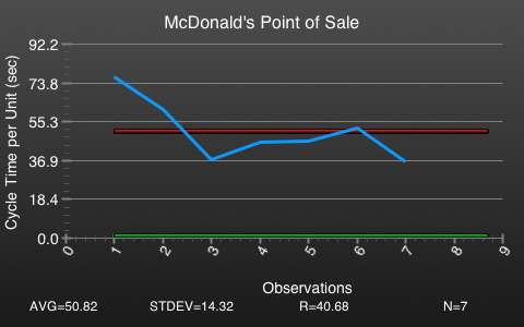
And, here is the run-of-the-mill run chart for the time at the point of sale.

And, below is the table of the data and the cycles I was able to measure.
| Cycle No. | Start Time Stamp | End Time Stamp | Cycle Time (sec) |
| 1 | 03-27-2012 06:40:24 PM | 03-27-2012 06:41:41 PM | 76.8675 |
| 2 | 03-27-2012 06:41:41 PM | 03-27-2012 06:42:42 PM | 61.137079 |
| 3 | 03-27-2012 06:42:42 PM | 03-27-2012 06:43:20 PM | 37.403771 |
| 4 | 03-27-2012 06:43:20 PM | 03-27-2012 06:44:05 PM | 45.62201 |
| 5 | 03-27-2012 06:44:05 PM | 03-27-2012 06:44:51 PM | 46.098925 |
| 6 | 03-27-2012 06:44:51 PM | 03-27-2012 06:45:44 PM | 52.427697 |
| 7 | 03-27-2012 06:45:44 PM | 03-27-2012 06:46:20 PM | 36.185668 |
Technology is amazing. What I normally would have done with a stopwatch and then plotting that data in Minitab or Microsoft Excel I was able to do on my iPhone. What do you think? Do you think an iPhone App like this is practical and helpful?


There’s an app for that? What is it?
Hi Andy,
Yeah, I failed to mention the name of the App. It’s called CTPlot and you can find it here int he Apple App Store:
http://itunes.apple.com/us/app/ctplot/id423722799?mt=8
Hi Pete,
I actually prefer this iphone tool to a standard stopwatch for many simple studies because it is just as easy to use (if not easier), and, all the while, it gathers more information. For more complex studies, I usually don’t use a stopwatch, but will use software like UmtPlus on an iPad to get a more complete picture of what’s going on.
I found that iPhone app around the same time you did, and I have found it to be quite useful. Did you know the same company makes a couple of other similar programs that do pareto and some other simple graphical analysis?
I find that their Pareto tool has been useful when observing a process with a number of known defects to help quantify and prioritize the frequency of each defect. That all of this can be done, as you said, at the gemba is extremely helpful at times.
Regards,
– Joe